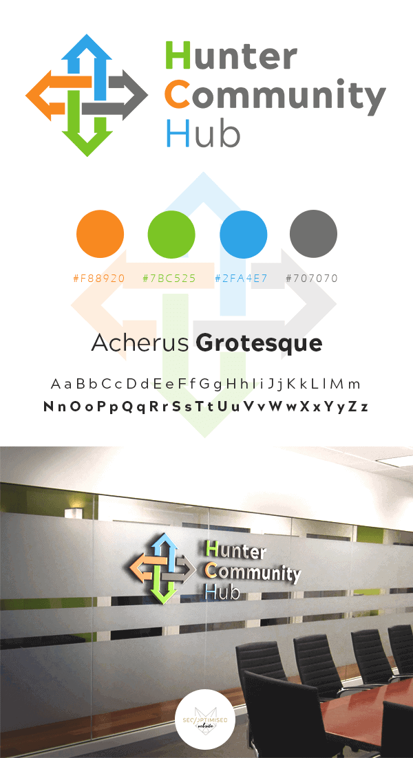
The brief for the Community Education Program Logo involved some colour research to ensure the final product featured trustworthy colours that are able to be seen by people with disabilities such as colourblindness. We came up with the interlinking arrows as this was what the original logo featured. The client wanted to keep some ideas from the old logo, to be updated and freshened up for the new design.
The interlinking arrows represent the sectors of the community and the services offered by our client and we think it conveys the message perfectly. You can see the carefully chosen colour scheme below the logo with the font type there as well.