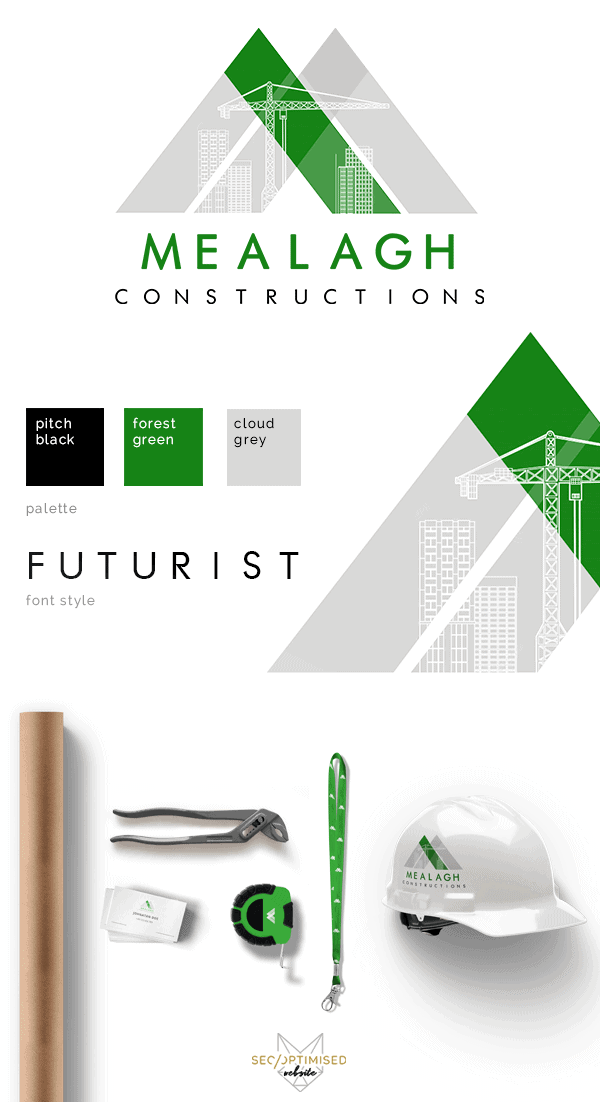
This Construction Company Logo client had the brief that they wanted to include a crane, Irish hills and the colour green. We managed to stylise the hills to form an M and add the high rise buildings and a crane into the M. The client wanted to use forest green to reflect his Irish heritage and pay homage to his home town. We loved working on this logo as it was such a specific brief and we wanted to move away from the usual hammer and nails type logo. We love working with logos like this because its a challenge to fit in all the ideas from the client into a workable design.
This logo is super versatile and can work on dark or light backgrounds. We really nailed the brief on this one. The colour choices for this logo really work well together and the forest green is a great addition to a construction company logo as most logos in this industry usually stick with blues and greys. The green pops and it really does make you think of Ireland. As you can see it transfers well to stationary, merchandise as well as vehicle signage and wraps. Also the website can work well with the three piece colour scheme as seen on this logo design.