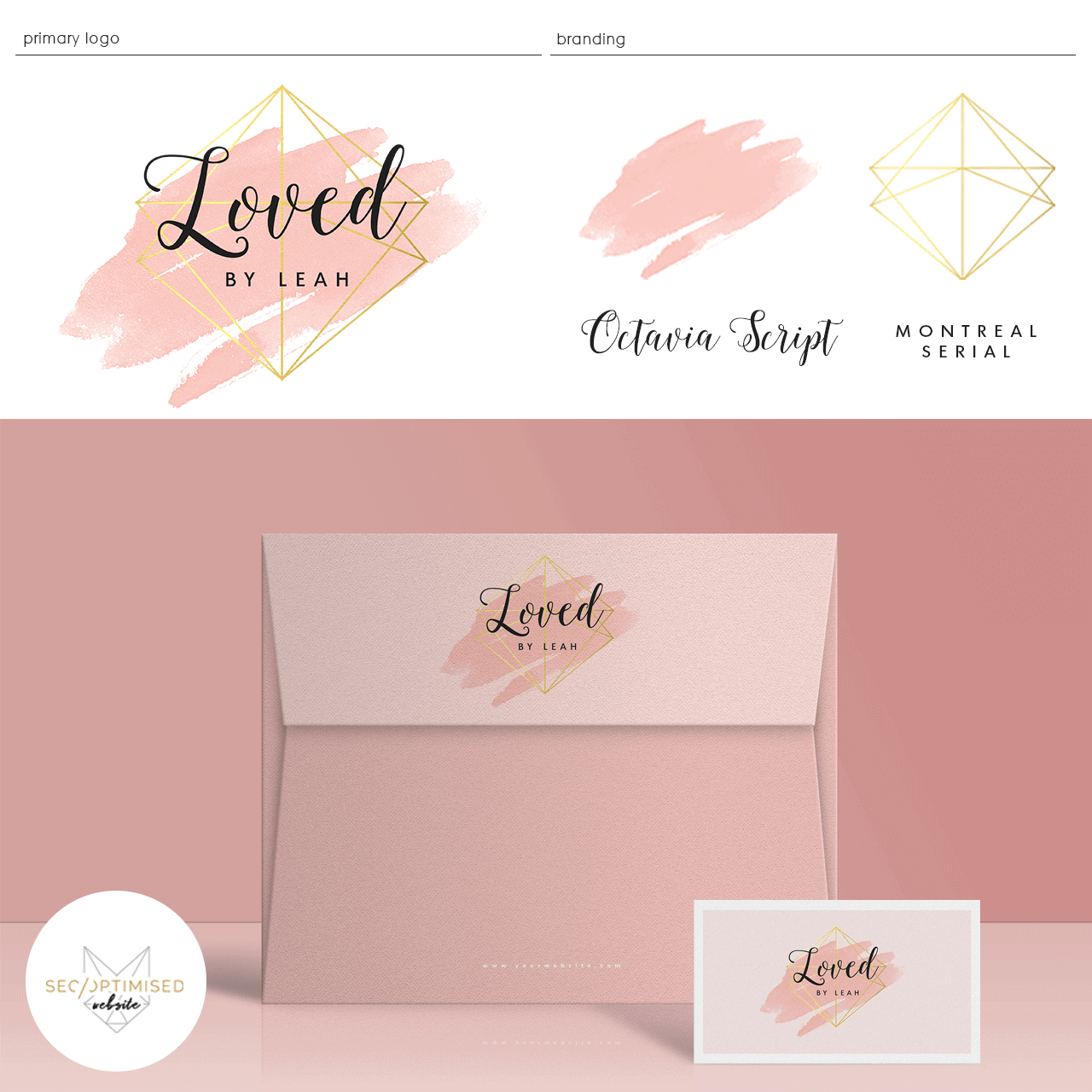
The brief was for a Pink Gold Watercolour Logo for a client. The client wanted to explore watercolour in pink with a bold gold geometrical shape. We ended up with this stunning and modern combination for the client. The infusion of gold gives the logo a modern edge while the watercolour background in pink, really adds some femininity to the design.
The elements work together perfectly and with the addition of 2 different fonts, the logo sets itself above the rest. This type of logo is suitable for a range of uses, in this case, the client has a content blog. The design makes this pink gold watercolour logo ideal for use on a website. The pink and gold combo of colours will really make the website pop and is in line with modern trends in website design. The logo can be used with or without the pink background which makes it ideal for use in videos, stationary and even embroidered onto t-shirts or other uniforms.
Octavia script is a beautiful font which has many uses. Many clients love this font because it looks great in so many settings. Here with the pink and gold its very feminine but teamed with a different colour scheme, Octavia can also represent masculinity. The addition of Montreal Serial grounds this logo so that it’s very relatable without being common.

