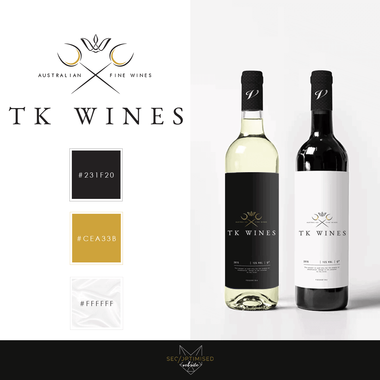
This one was for a Wine Wholesaler Logo Design who wanted to steer away from the regular run of the mill looks, but without losing the traditional look and feel of a wine label. With the brief in mind, we wanted to keep the wine glass as part of the design so it wasn’t too far removed from it’s roots. The colour palette is quite versatile and lends itself to digital, print as well as looking lovely as an embroidered emblem. This design also looks good on a black background as well as a white because of the versatility of the colour scheme and design. As far as website design for this type of logo, the structure of it means that it fits well into logo slots on most wordpress websites and will also look great as an email signature.
The client was very happy with the outcome and we enjoyed creating this design for them. Our clients come from so many industries, and we are comfortable designing a range of items and marketing collateral. We have another wine wholesaler logo for you to take a look at. This logo design is versatile and the colour scheme of gold, white and pearl make it a great choice for any type of website or collataral. Decorating wine bottles can be tricky because you have to attract the person as they are passing by the shelves. You only have a few seconds to grab their attention so you have to be sure to make something that they will remember easily.


